Animated videos
National Education Association promo videos
I should say right off the bat: I am not an animator, but I know a guy (I actually know three). So if you’re looking for a uniquely illustrated and animated video that’s fun to watch, I can put together the team to get that done. My part can involve everything from developing the concept, to writing the script, to creating storyboards, to illustrating the layered files.
I developed and illustrated the storyboards and layered Illustrator files for this set of videos promoting Education Support Professionals — the unsung heroes of our public school system. Animation by the extremely talented Adam Maurer.
Modern Wood Heat TV commercials
I also developed the boards and layered Illustrator files for this series of spots that have been running on-air in the Northeastern US over the past few years. These were also animated by the incomparable Adam Maurer.
Fin Tech explainer video
This last one I made while serving as Creative Director for a fintech startup in 2018-19, I was tasked with developing an animated explainer video to help the sales team better communicate the concepts of “digitized assets” and “tokenization” to investors. I co-wrote the script, illustrated the characters and backgrounds, provided the VO, and directed this video. The amazeballs Motion Factory provided animation.
Our sales team reported an immediate increase in the conversion rate after they began to use this video instead of the pitch deck they’d been using before. Hooray!
Creative campaign
Another extremely fun project was this campaign for a credit union that needed to increase awareness of a seldom-used app feature called Pocket-to-Pocket—a quick and safe way to send money to friends and family. So the question became: how do we let people know that Pocket-to-Pocket even exists?
Puppets is how.
I grabbed an old pair of pants and turned them into “Mike’s pocket”.
Suddenly there was a whole world of pocket-puppets, sending money for various reasons. A pocket paying his friend back for lunch. A grandma sending her college-age grandkid some grocery money. But it wasn’t a commercial campaign yet; they needed a series of branded posters and rack cards for their customers to see/read while waiting in line.
I chose to show the relational interactions through text messages because a) pockets using phones is funny, b) mobile devices are central to the app feature anyway, and c) it’s more fun to read someone else’s texts than a bunch of bullet points.
Using the existing brand style guide, I created a uniform footer that clearly suggested “Pocket-to-Pocket is brought to you by MCT Credit Union”. I also devised a pop-up in-app splash page to remind users about the feature.
I rounded out the proposal with a 15-second radio spot, partially to bring the pockets to life by lending them some voices, but also to serve as a teaser for the notion of local television commercials featuring actual puppets.
That was not in the budget, it turned out.
Informational Poster
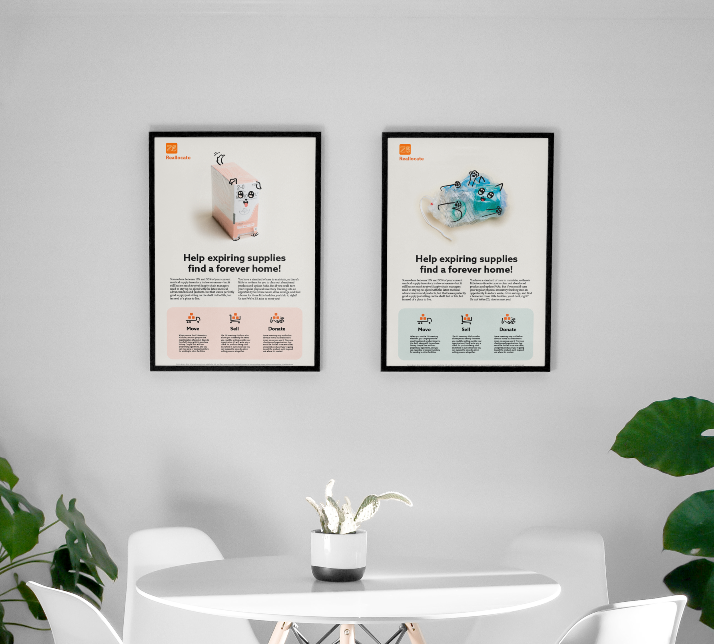
Before they hired me as their full-time brand and marketing designer, I designed these posters for Z5 Inventory. They save hospital systems millions of dollars by, among other things, reallocating their inventory before it expires. This makes their service incredibly appealing to the decision makers, but it’s not always easy to get the hospital staff to participate when they’re, you know, trying to save lives instead of money.
The posters needed to appeal to the workers on the ground, maybe help them understand the purpose of the program and to keep an eye out for expiring product. For them, the annual spend on inventory wasn’t a strong motivator; I needed to get them to see medical supplies for their intrinsic value.


